Alternate fonts make Gnome easier on the eyes
I have poor eyesight. It's so poor that at times I prop my glasses up on my forehead and stick my face right into the monitor to read. This, of course, leads to great hilarity as my office mates come by and laugh at the blind geek. It's one of the real drivers behind my move to notebooks and LCD screens. With today's sub-pixel aliasing technology in Windows (ClearType) and Linux, reading text off of LCDs is a lot easier for me than reading text off of an older CRT.
Having sub-pixel aliasing and LCD screens isn't enough. You have to pick the right font as well. For Windows XP that isn't an issue. From the moment it's turned on the fonts on the desktop and in all the applications are correct and easy to read. The same is true, it appears, for Mac OS X. The same is not true for Suse 10 or 10.1 (the fonts selected by Ubuntu's live distribution (at least Dapper Drake) are, however).
I've discovered that the best fonts for this combination of notebook display and Suse 10.1 is Bitstream Vera Sans, Bitstream Vera Sans Mono, and Bitstream Vera Serif. These fonts provide clear readable text on the LCD display in just about every point size from 11 on up. It makes working on the Linux graphical desktop easy, especially for long periods of time. And it adds beauty to the overall look of the graphical desktop.
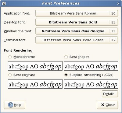
The fonts as they are now. Note subpixel smoothing is enabled.
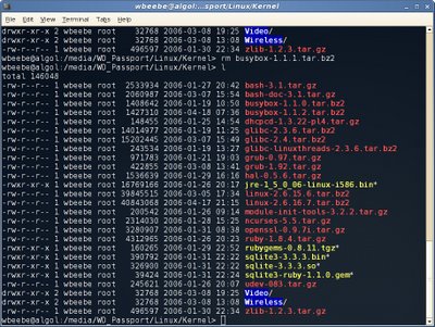
An example of Bitstream Vera Sans Mono in Gnome terminal.
Note
You have to go into Firefox and set the same fonts explicitly. Firefox doesn't get its font hints from Gnome (or KDE) the way it does from Windows.
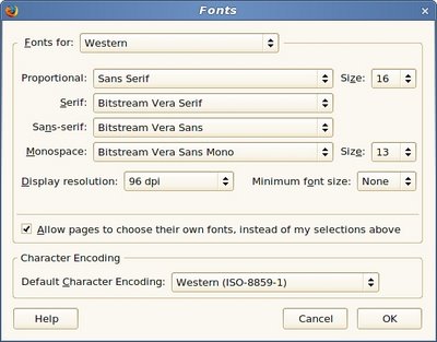
The fonts dialog in Firefox. You get here via Edit | Preferences | Content.
Having sub-pixel aliasing and LCD screens isn't enough. You have to pick the right font as well. For Windows XP that isn't an issue. From the moment it's turned on the fonts on the desktop and in all the applications are correct and easy to read. The same is true, it appears, for Mac OS X. The same is not true for Suse 10 or 10.1 (the fonts selected by Ubuntu's live distribution (at least Dapper Drake) are, however).
I've discovered that the best fonts for this combination of notebook display and Suse 10.1 is Bitstream Vera Sans, Bitstream Vera Sans Mono, and Bitstream Vera Serif. These fonts provide clear readable text on the LCD display in just about every point size from 11 on up. It makes working on the Linux graphical desktop easy, especially for long periods of time. And it adds beauty to the overall look of the graphical desktop.

The fonts as they are now. Note subpixel smoothing is enabled.

An example of Bitstream Vera Sans Mono in Gnome terminal.
Note
You have to go into Firefox and set the same fonts explicitly. Firefox doesn't get its font hints from Gnome (or KDE) the way it does from Windows.
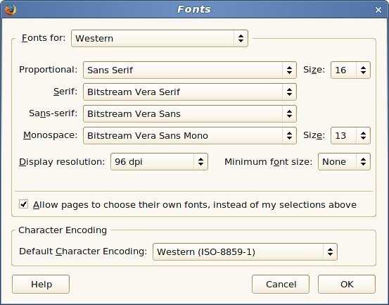
The fonts dialog in Firefox. You get here via Edit | Preferences | Content.


Comments
Post a Comment
All comments are checked. Comment SPAM will be blocked and deleted.