On using the old/new E-1
 |
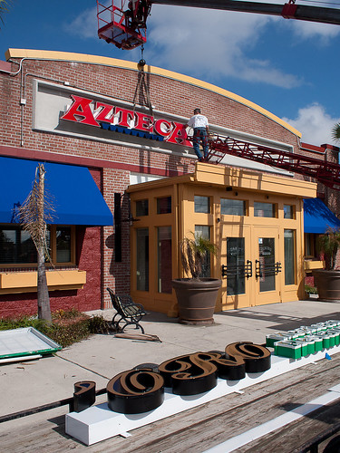
| "Azteca Final Exterior" Olympus E-1 with Zuiko Digital 9-18mm 1/500s, f/7.1, ISO 100, 12mm |
The image above had minimal post processing. According the LR's history, I performed a tiny bit of cropping to remove the shadow of my head on the bottom edge, some smidgen of exposure correction, a little sharpening, and boosted black clipping to from 4 to 10 (I like my blacks black). I could have left it alone and simple converted from RAW to JPEG, but I tinker with all my images; it's part of the enjoyment I get from photography. For the most part, however, the glorious colors captured above were already there in the RAW image. I just wanted to accentuate them a bit more.
Compare the image above with the image below, taken with the Olympus E-P2 and the M.Zuiko 17mm.
 |
| "Azteca Signage Going Up" Olympus E-P2 with M.Zuiko 17mm 1/2000s, f/5.6, ISO 200, -0.3 EV |
Yes, they're different, and depending on the mood I'm in at the moment I'll favor one or the other. But to my eyes they're both great, and the E-1 most definitely holds its own. I'm very happy with the way the E-1 image turned out. I used two more E-1 images (with the Sigma 30mm) in my prior post about the DirecTV blimp.
I'm not yet ready to weigh in with gory detail on how good or bad it is compared to my other cameras (E-300, E-3, and E-P2), but I will say this; IQ wise it holds its own, mechanically its a beautiful sculpture compared to the slab-sided E-3, but operationally, you can really tell it was manufactured seven years ago. The E-1 is missing features I've come to take for granted on the E-3 and E-P2, and it's resulted in some awkward moments. It's probably time to print out the E-1's PDF manual and read it. Then work some more with the E-1. Then write something worth reading. Having loads of fun regardless.

Comments
Post a Comment
All comments are checked. Comment SPAM will be blocked and deleted.