A little here, a little there
Orlando Diary
Shopping at a grocery a grocery store is a wonderful teaching experience, and today was no example. I had to make a morning run to a local Publix to pick up a few items for breakfast. While I was in the citrus juice section I naturally gravitated towards Tropicana, the "quality" brand.
Tropicana does taste pretty good. But this time, for whatever reason, I paid attention to the printing at the very bottom of the juice carton.
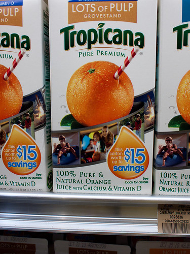
When you walk into to a well-maintained grocery store such as Publix, you'll find all products are neatly arranged, lined up in rows together, on their respective shelves. Orange just in two quart containers is no exception. Being square, it's very easy to dress them up by pulling them tightly against the front lip of the shelf edge (figure 1). Note that the lowest 1/4 inch or so of the bottom of the carton is cut off from view (figure 2).
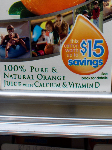
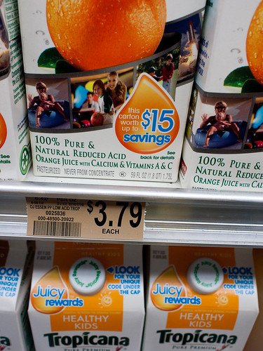
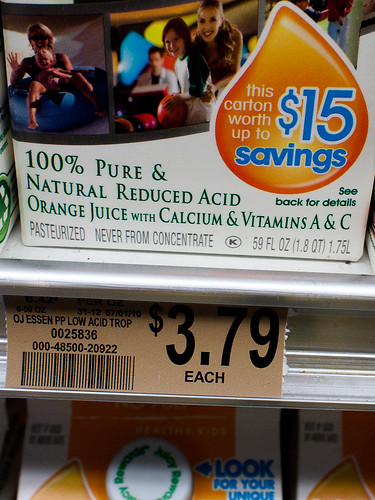
You don't appreciate what's happening until you push the carton back less than an inch (figure 3), and you happen to look down and read the bottom edge of the carton (figure 4). That's when you realize it's not two quarts of Florida sunshine in that Tropicana carton (64 fl oz), but 1.8 quarts, or 59 fl oz. Tropicana decided to add to their profitability by putting 5 less ounces in each carton. And there's no size difference between a Tropicana carton and a carton that has two full quarts, such as Florida Natural Premium or Publix's on in-store brand (both currently sell for $2.99/carton).
But what makes this all a little more conspiratorial is that the text that lets you know this is printed in light gray, in small text, and in such a location that it's covered when pushed up against the shelf's retaining edge. Maybe Tropicana didn't mean to have their cartons printed this way, but I find it interesting that Florida Natural Premium, for example, has a larger font, in black, and visible when lined up on the shelf the same way.
This isn't the first time a major company has tried to pull a fast one like this. Similar acts started around 2008 when the economy really started to take a nose dive. Sixteen ounce containers with just 15 (or less), bags of snack food (like potato chips) with more air than content, and other lowering of content while keeping the containers the same size were just another way to stealthily raise prices; keep the front price the same while lowering the quantity in the container. This type of deception goes back millennia to dishonest tradesmen who would hollow a little gold out of coins that passed through their hands, or add filler to cargo to keep more for themselves. In this day, it's just a cynical corporate decision of splitting a price increase; you wind up paying more for less. And that leaves a bad taste in my mouth, no matter how good the orange juice is.
Equipment Used
Olympus E-P2, M.Zuiko 17mm f/2.8
Shopping at a grocery a grocery store is a wonderful teaching experience, and today was no example. I had to make a morning run to a local Publix to pick up a few items for breakfast. While I was in the citrus juice section I naturally gravitated towards Tropicana, the "quality" brand.
Tropicana does taste pretty good. But this time, for whatever reason, I paid attention to the printing at the very bottom of the juice carton.
 |  |
| Figure 1 | Figure 2 |
 |  |
| Figure 3 | Figure 4 |
But what makes this all a little more conspiratorial is that the text that lets you know this is printed in light gray, in small text, and in such a location that it's covered when pushed up against the shelf's retaining edge. Maybe Tropicana didn't mean to have their cartons printed this way, but I find it interesting that Florida Natural Premium, for example, has a larger font, in black, and visible when lined up on the shelf the same way.
This isn't the first time a major company has tried to pull a fast one like this. Similar acts started around 2008 when the economy really started to take a nose dive. Sixteen ounce containers with just 15 (or less), bags of snack food (like potato chips) with more air than content, and other lowering of content while keeping the containers the same size were just another way to stealthily raise prices; keep the front price the same while lowering the quantity in the container. This type of deception goes back millennia to dishonest tradesmen who would hollow a little gold out of coins that passed through their hands, or add filler to cargo to keep more for themselves. In this day, it's just a cynical corporate decision of splitting a price increase; you wind up paying more for less. And that leaves a bad taste in my mouth, no matter how good the orange juice is.
Equipment Used
Olympus E-P2, M.Zuiko 17mm f/2.8


Comments
Post a Comment
All comments are checked. Comment SPAM will be blocked and deleted.