Working with Netbeans 4.2 Dev - Part 2
I pulled down and installed the latest daily NetBeans 4.2 development build (6_Jul_2005_1800) and installed it. One nice feature I discovered by doing this: I could uninstall an older version and install the latest version and still have my projects and other settings come back up in the newest installed version. Excellent.
The reason for installing this version was to check out any updates/fixes to Matisse. I pulled up the original toy UI built with the June 28th release. This time I was able to drop sliders on the form and set them vertically, as well as change their size without generating exceptions. Again very good.

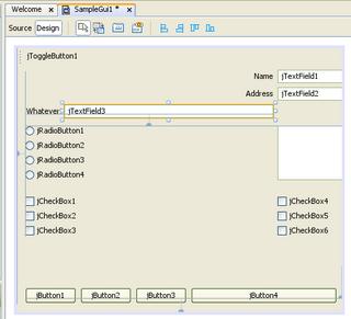
But this time I ran into a new problem. I attempted to move the top three labels over to the left and the accompanying text boxes. The next images shows what happened when I tried that action with the "Whatever" label and associated text box. Nearly all the other controls were re-located over to the far right and chopped off. I suppose I could have stretched the panel to re-expose everything and then attempt to relocate all the other controls, but the immediate question is why should I have to?

On my last post, Arseniy commented:
The reason for installing this version was to check out any updates/fixes to Matisse. I pulled up the original toy UI built with the June 28th release. This time I was able to drop sliders on the form and set them vertically, as well as change their size without generating exceptions. Again very good.

But this time I ran into a new problem. I attempted to move the top three labels over to the left and the accompanying text boxes. The next images shows what happened when I tried that action with the "Whatever" label and associated text box. Nearly all the other controls were re-located over to the far right and chopped off. I suppose I could have stretched the panel to re-expose everything and then attempt to relocate all the other controls, but the immediate question is why should I have to?

On my last post, Arseniy commented:
Generated layout is not based on a grid concept nor on absolute XY coordinates (it uses parallel / [sequential] groups of components instead), and the guidelines seem to be good enough to visualize the constraints between components...I'm concerned about the complexity of trying to manage N constraints between M components where both N and M grow large over time. Watching all the other controls shoot around the form when I moved just one control showed me that Matisse's developers have got a way to go with properly managing constraints as controls are moved and resized. In spite of what Arseniy says I firmly believe the layout tool that will be the most successful is going to be the layout tool that does use a grid to help lay down controls. And before anybody jumps to the conclusion that I'm in love with the Eclipse Visual Editor, let me assure you I'm not. Both show promise but both need a lot more work. If you want a professional Java UI layout tool at this point in time then your best bet is to buy one.

Just 2 quick comments:
ReplyDelete1) The layout model behind Matisse is not a generic M:N constraints system (like e.g. SpringLayout support would be). It is rather a tree hierarchy - like nested containers and components, but managed within the layout manager using "layout groups".
2) As for the grid - depends on what you mean by grid. The coordinate grid as used in VB, Delphi, Apple Interface Builder etc is not usable for java GUIs as it positions each component absolutely. Another type of grid is the component grid like in a spread sheet. It is known e.g. from TableLayout or FormLayout (JGoodies). This is a powerful system, but we've found it not suitable for the design experience we wanted in Matisse. (The exact reasons would be on longer write-up.)